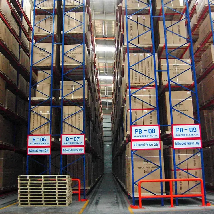

Hey there! I'm a supplier of gravity racking systems, and one question I get a lot is, "How do I choose the right color for a gravity racking system?" Well, you're in the right place because I'm gonna break it down for you.
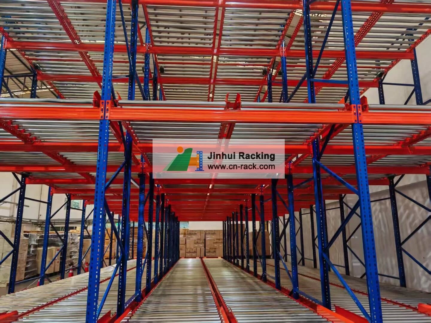
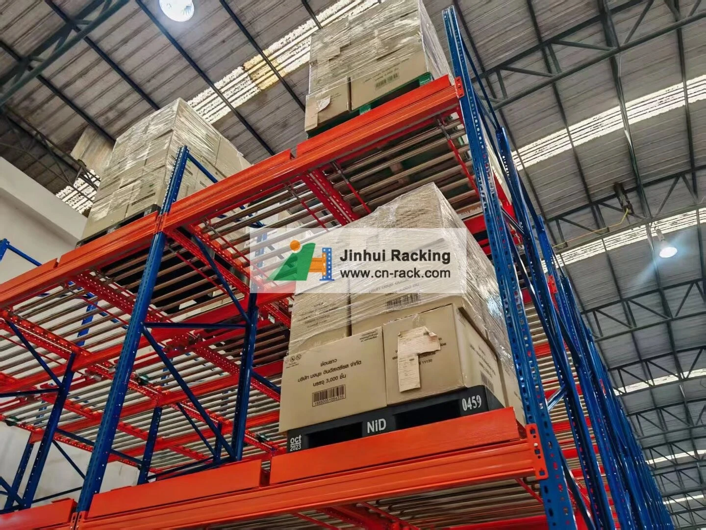
Why Color Matters
First off, you might be thinking, "It's just a rack. Who cares about the color?" But trust me, color plays a big role. It's not just about aesthetics; there are practical aspects too.
- Visibility: In a busy warehouse, visibility is key. You want your gravity racking system to stand out or blend in depending on your needs. For example, if you have a lot of foot traffic or forklift movement, a bright color can help workers easily spot the racks and avoid collisions.
- Safety: Certain colors are associated with safety. For instance, yellow is often used to indicate caution. By choosing the right color, you can enhance safety in your warehouse.
- Brand Identity: If you want your warehouse to reflect your brand, you can choose colors that match your company's logo or brand palette. This creates a cohesive look and reinforces your brand image.
Factors to Consider
1. Warehouse Environment
The first thing you need to think about is the environment of your warehouse.
- Lighting: If your warehouse has poor lighting, a lighter color can help reflect light and make the space feel brighter. On the other hand, if you have a lot of natural light, you can go for darker colors without making the space feel too gloomy.
- Temperature: Dark colors absorb more heat than light colors. So, if your warehouse is in a hot climate or has poor ventilation, lighter colors might be a better choice to keep the temperature down.
- Dust and Dirt: In a warehouse where dust and dirt are common, you might want to choose a color that doesn't show stains easily. Darker colors are generally better at hiding dirt compared to lighter ones.
2. Functionality and Usage
- Product Storage: If you're storing products that are sensitive to light, you might want to choose a color that offers some level of light protection. For example, dark colors can help block out sunlight and prevent damage to light-sensitive products.
- Inventory Management: Color-coding is a great way to organize your inventory. You can assign different colors to different product categories, locations, or storage levels. This makes it easier for your workers to find and pick products quickly.
3. Aesthetic Preferences
At the end of the day, you also want your warehouse to look good. You might have a certain aesthetic in mind for your space, and the color of your gravity racking system can contribute to that. Some people prefer a modern, minimalist look with neutral colors like gray or white, while others might want a more vibrant and colorful warehouse.
Popular Color Choices
1. Blue
Blue is a popular choice for gravity racking systems. It's a calming and professional color that gives a sense of stability. It's also easy to see in different lighting conditions, making it a good option for warehouses. You can check out our Heavy Duty Pallet Racking System, which is available in a nice shade of blue.
2. Yellow
Yellow is a high-visibility color that's often associated with safety. It's great for highlighting areas that need extra attention, such as aisleways or areas near machinery. Our Teardrop Pallet Rack comes in a bright yellow option that can really make your warehouse stand out.
3. Gray
Gray is a neutral and versatile color that can blend in with any warehouse environment. It gives a clean and modern look, and it's also great at hiding dirt. If you're going for a more subtle and professional aesthetic, gray might be the way to go. Take a look at our Industrial Heavy Duty Rack in gray.
4. Green
Green is a color that represents nature and sustainability. It's a good choice if your company has an eco-friendly image or if you want to create a more pleasant working environment. Our Heavy Duty Storage Drawer Racking Industrial Mold Rack System is available in a nice shade of green.
5. Red
Red is a bold and attention-grabbing color. It's often used to indicate danger or emergency exits. While it might not be suitable for the entire gravity racking system, you can use red accents to highlight specific areas or to make your racks more visible. Our New Design Motorized Mobile Racks System Railed Racking Pallet Racking Storage Rack Warehouse Rack With High Load-Bearing has some options with red accents.
Making the Decision
Once you've considered all these factors, it's time to make a decision. Here are some steps to help you:
- Visualize: Use software or create a mock-up to see how different colors will look in your warehouse. You can also look at samples of the colors if possible.
- Get Feedback: Talk to your employees, especially those who work directly with the racks. They might have some valuable insights based on their daily experiences.
- Test it Out: If possible, get a small section of the rack in the color you're considering and install it in your warehouse. This will give you a real-life look at how the color works.
Conclusion
Choosing the right color for your gravity racking system is not as simple as it might seem. It's a decision that involves considering various factors, from the warehouse environment to your aesthetic preferences. By taking the time to think about these things, you can choose a color that not only looks good but also enhances the functionality and safety of your warehouse.
If you're interested in our gravity racking systems and want to discuss the color options further, feel free to reach out. We're here to help you make the best choice for your warehouse. Whether you need a Teardrop Pallet Rack, Industrial Heavy Duty Rack, Heavy Duty Storage Drawer Rack, Use forklift Warehouse Storage Heavy Duty Pallet Racking System, or New Design Motorized Mobile Racks System, we've got you covered.
References
- "Color Psychology in Warehouse Design." Journal of Warehouse Management.
- "The Importance of Visibility in Warehouse Safety." Safety First Magazine.
- "How to Choose the Right Color for Your Industrial Equipment." Industrial Equipment Review.